
Branding Pabst Photo | Details Below
Heading – 1
Heading – 2
Heading – 3
Heading – 4
Heading – 5
Heading – 6
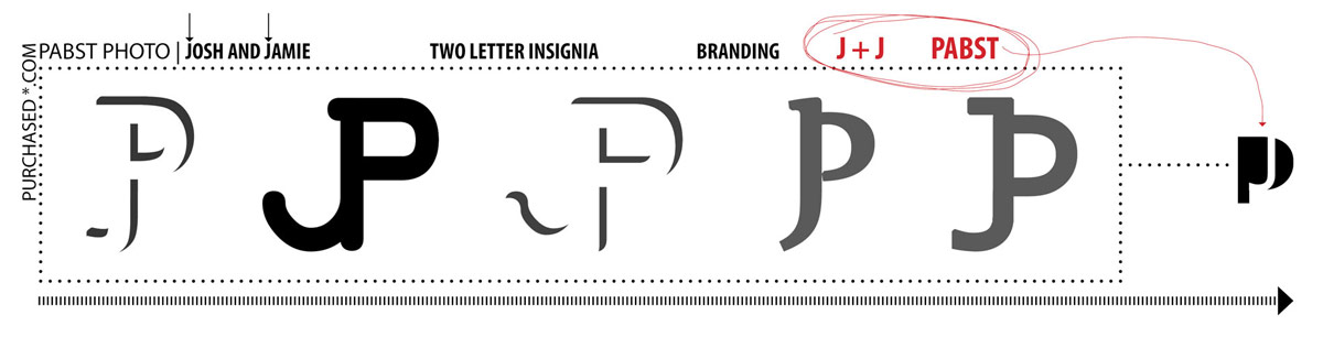
The early stages of web design – things like fonts and graphics and logos are all being developed simultaneously. With any luck we will have all these details nailed down in the not too distant future. We began as we do with most projects and that is with massive precedent studies and inspiration hunting. This included finding websites, graphics, logos, pictures, and just about anything you can think of that we like and might want to call upon when it came time to do our own branding. Our first thought was merging our initials, which were JB and JP as we got married at the same time we were redesigning. Now we, Jamie and Josh, both have the same initials. Jamie and Josh Pabst. Below is the first pass at sketch style graphics.
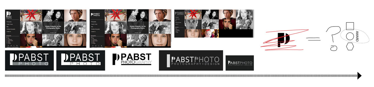
 Next, we moved away and went in an entirely different direction. It’s important for graphic designers to always investigate several directions. Just because one idea seems like a good idea, it’s critical not to fall in love with anything too early. We started looking at a general ‘P’ and ditching the ‘J’ because there is no J in Pabst Photo afterall. Without getting rid of it completely we hid it more subtly within the P. We really liked the idea early on. We liked it enough that we started testing it on a mock website and mock-stationary. Similarly, we knew that it wasn’t quite right and again we tried not to fall in love with any single idea. This process was about 2 weeks in the making. The images here only represent 5% of the logo ideas explored.
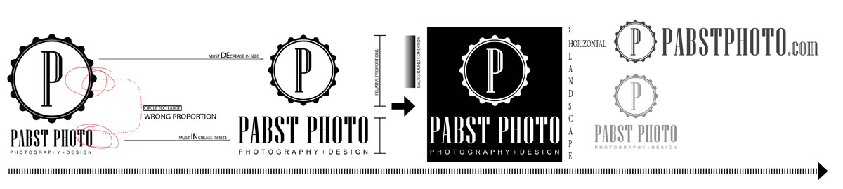
Finally, we went back to the drawing board so to speak and pused the logo design for a new direction. Something that was not font based. We both liked the idea of a strong graphic. A square or circle to keep it simple. As you can see above, we liked the idea of the circle- it reminded us of an award or the top of a ribbon. We began investigating how that would translate into our graphic. We ultimately landed on the graphic below.
We intend to update this post soon. Feel free to leave us your feedback. Thank for visiting Pabst Photo.